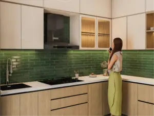
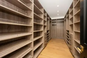
A practical color palette for home interiors begins with the materials that are hardest to change: flooring, stone, cabinetry, doors and large furniture. Paint, textiles and accessories can then connect those fixed finishes without relying on universal rules about which colors make people calm, productive or hungry.
This guide turns a design idea into a finish schedule that can be sampled, approved, priced and installed. The goal is a coordinated palette that works with the project’s light, materials, room use and acceptable variation.

Start with Fixed Finishes
List the items that will remain for years or are difficult to replace. Their undertones, patterns and sheen should guide the rest of the palette.
| Fixed item | What to record |
|---|---|
| Flooring | Material, base color, undertone, grain or pattern, grout and sheen |
| Stone or countertop | Slab or batch reference, dominant tone, veining, edge and finish |
| Cabinetry and joinery | Door style, laminate or veneer reference, paint code, grain direction and hardware finish |
| Doors and frames | Species or finish, frame color, glazing and hardware |
| Sanitary and metal finishes | White tone, brushed or polished surface, coating and acceptable variation |
| Large furniture | Upholstery, timber, metal and placement in the room |
Collect the real samples in one material board. Screen colors and renderings are useful for direction, but they cannot fully show texture, gloss, natural variation or how adjacent finishes affect one another.
Test Color in the Actual Light
Daylight direction, window size, artificial lighting, surrounding colors and surface sheen can change how a finish appears. Benjamin Moore’s sampling guidance recommends testing paint from morning to evening under both natural and artificial lighting.
- Place a sufficiently large sample on more than one wall.
- Review it beside the actual floor, cabinet, stone and fabric samples.
- Check morning, midday and evening conditions with the specified lamps.
- Record the paint product, color code and sheen—not only the color name.
- Approve a site sample or sample room where several finishes meet.
Use Undertone and Contrast Instead of Color Stereotypes
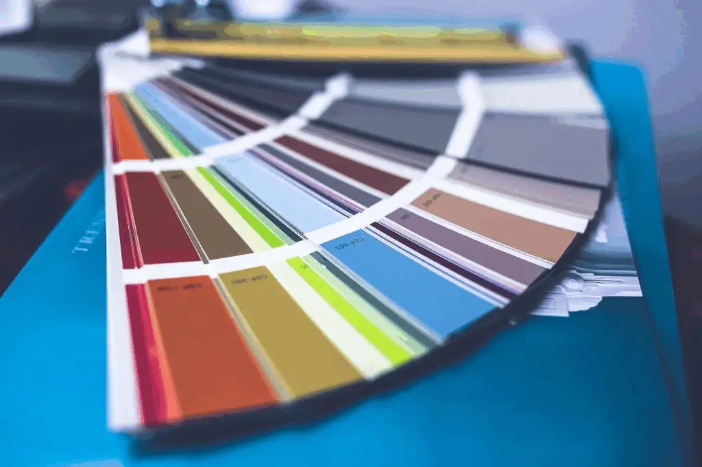
Warm, cool and neutral labels can help organize options, but a named color does not guarantee a particular emotional effect. Judge it in context. A warm grey may shift toward violet beside one floor and toward beige beside another. A white paint can appear different next to warm timber, cool stone or a strongly colored curtain.
- Dominant finish: usually the largest or least flexible surface, such as the floor or cabinetry.
- Supporting finish: connects the dominant material to walls, doors and furniture.
- Accent: adds controlled contrast through smaller, replaceable elements.
- Continuity: repeats one undertone, material or metal finish across connected rooms.
- Contrast: supports legibility and visual hierarchy; it should be intentional rather than accidental.
The often-used 60-30-10 proportion can be a brainstorming aid, but it is not a technical rule. Open plans, patterned stone, timber grain and large windows may need a different balance.
Match the Palette to the Room and Materials
| Area | Palette priorities | Technical checks |
|---|---|---|
| Living and dining | Continuity across long views, furniture and feature materials | Daylight variation, glare, cleanability and lighting color temperature |
| Bedroom | Personal preference, textiles and controlled contrast | Blackout treatment, reading light, wall durability and touch-up |
| Kitchen | Cabinet, countertop, backsplash, appliance and floor coordination | Stain resistance, sheen, grout, edge details and sample approval |
| Bathroom | Tile, stone, sanitary white, metal and vanity coordination | Wet-area suitability, slip requirement, sealant, cleaning and water conditions |
| Circulation | Transitions between room palettes | Wear, artificial light, signage and visibility of steps or level changes |
Coordinate Texture, Pattern and Sheen
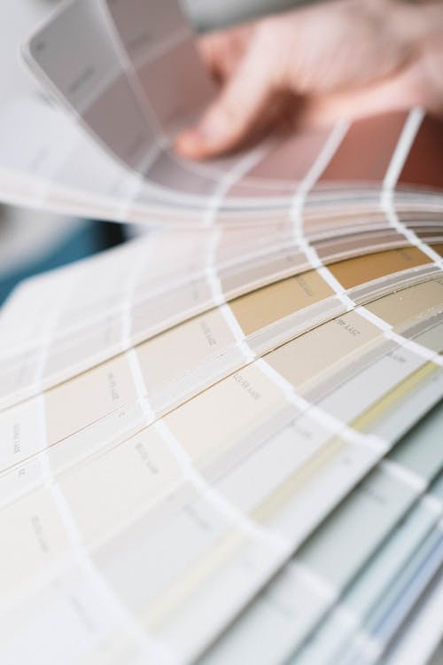
Matte, satin, textured and polished surfaces reflect light differently. Natural stone, timber and veneer also vary from piece to piece. Specify the permitted range and approve representative samples rather than expecting every item to match a small swatch exactly.
- Limit the number of strong patterns competing in one view.
- Review stone veining and timber grain at the intended scale.
- Coordinate grout, sealant, edge bands and trims with the main materials.
- Use a mock-up for important material junctions or feature areas.
- Keep signed or dated control samples for production and site inspection.
Turn the Palette into a Finish Schedule
| Schedule field | Example of useful information |
|---|---|
| Finish code | PT-01, ST-02, WD-03 or another drawing reference |
| Location | Room, wall, floor, ceiling, joinery or item reference |
| Manufacturer and product | Named series, code, substrate and finish |
| Color and sheen | Color code, gloss level or approved sample reference |
| Size and pattern | Module, thickness, grain direction, layout and joint |
| Performance | Only the project-required classification or test data |
| Approval | Sample, mock-up, drawing, approver and date |
| Variation and batch | Accepted range, batch control and replacement stock |
A project example such as the Philippines villa interior material project shows why cabinet finishes, room palettes and furniture dimensions need coordination. For joinery-specific finish control, review the kitchen cabinet design and approval guidance.
Sample Approval and Procurement Workflow
- Issue the plans, reference images and preliminary finish schedule.
- Identify fixed materials and shortlist compatible paint, fabric and metal finishes.
- Collect physical samples with product codes and batch information.
- Review the board under project lighting and prepare a sample room or mock-up where needed.
- Record comments, revisions and the approved control sample.
- Align every quotation with the same approved schedule and quantity.
- Check production samples, batch-sensitive materials, labels and spare quantities before shipment.
- Use the signed schedule and samples for site inspection and replacement orders.
George House Material can coordinate finish schedules, product samples, quotations, drawings, production follow-up and consolidated delivery around the approved palette. Send the plans, room list and available material references through the project enquiry page.
Frequently Asked Questions
Should the floor or wall color be selected first?
Usually start with the least flexible fixed materials, such as flooring, stone and cabinetry. Wall paint is easier to adjust after those samples are approved.
Can a screen rendering approve the final color?
It can support design review, but final approval should use physical samples under relevant lighting because screens do not reproduce every color, texture or sheen consistently.
How should natural variation be handled?
Define the acceptable range, review representative samples and retain a control sample. For stone, timber and veneer, one small piece may not show the full pattern or color range.