By George House/05,Dec,2025
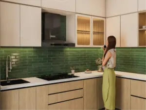
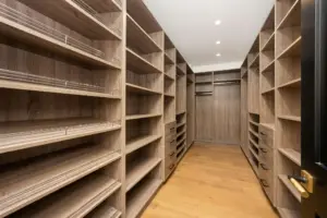
Kitchen floor tile ideas work best when the visual concept is tested against real project conditions. Color, pattern and tile scale affect the room’s appearance, while surface classification, cleaning, grout, substrate, transitions and installation details determine whether the floor is practical.
Begin with the cabinet, countertop and backsplash palette, then compare full-size floor samples under the project lighting. The selected tile should also have product data suitable for the intended floor location and exposure. Texture alone does not prove slip resistance, and a material’s appearance does not establish its durability.
This guide focuses on color, pattern, scale and coordination. For technical material and performance checks, use the separate kitchen floor tile selection guide.
Start with the Kitchen Performance Brief
(Source)
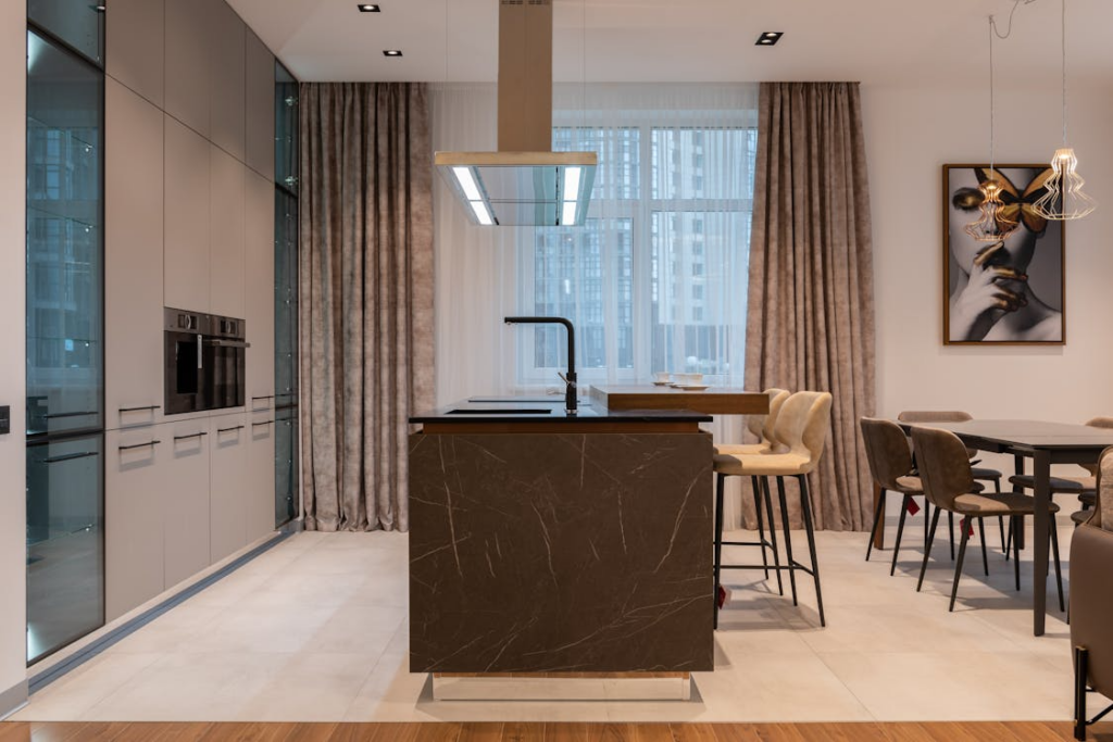
Before comparing colors, confirm where the tile will be used and how the kitchen will operate. A family kitchen, rental unit, hotel pantry and commercial food area can have different traffic, cleaning and safety requirements. Identify wet zones, exterior doors, island circulation, underfloor heating, floor drains, expected cleaning products and adjoining floor finishes.
- Interior floor-use suitability for the exact tile
- Declared slip, abrasion, stain and chemical data required by the project
- Tile thickness, actual size, edge condition and allowable variation
- Substrate flatness, waterproofing or crack-isolation strategy where applicable
- Movement joints, door thresholds, floor drains and transitions
- Cleaning method, maintenance expectations and replacement stock
The overview of different kinds of floor tiles can help narrow the material family before the visual design is developed.
Coordinate Floor Color with Cabinets and Countertops
Light Neutral Tile
Warm white, cream, pale beige and light greige floors can support an airy palette, but the undertone matters. A cool gray tile beside warm oak cabinets may look blue, while a yellow-beige floor can conflict with a cooler white countertop. Compare samples vertically and horizontally beside the actual cabinet, worktop and backsplash finishes.
Mid-Tone Stone and Concrete Looks
Mid-tone stone or concrete effects can bridge light and dark finishes while making everyday debris less visually dominant than very pale or very dark floors. Review graphic variation across several pieces so the approved sample represents the installed range rather than one tile.
Dark Tile
Charcoal, deep brown and dark stone effects create contrast with pale cabinetry, but they may show light dust, crumbs, mineral residue or scratches depending on the finish. Test cleaning and view the surface under direct and reflected lighting before committing to a large area.
Wood-Look Tile
Wood-look porcelain can visually connect a kitchen with adjacent living areas. Check plank width, length, pattern repeat, shade range, surface relief and grout color. The layout should avoid repetitive graphics and excessive lippage, especially where long planks meet strong side lighting.
Choose a Pattern That Fits the Room
(Source)
| Pattern idea | Visual effect | Coordination check |
|---|---|---|
| Straight grid | Quiet, ordered appearance that suits many large-format tiles. | Align key joints with cabinet ends, island edges, doorways and the main sightline. |
| Running bond | Adds movement and can soften a rigid plan. | Use the tile manufacturer’s permitted offset; long units may require a reduced offset to control lippage. |
| Diagonal | Creates a dynamic field and changes how the room edges are perceived. | Expect more perimeter cuts and waste; set out the centerline before ordering. |
| Herringbone or chevron | Creates a strong directional feature. | Confirm module, joint width, starting point, border treatment and extra cutting allowance. |
| Checkerboard | Provides clear contrast and a traditional or graphic character. | Approve both colors together and confirm equal thickness, size, finish and product suitability. |
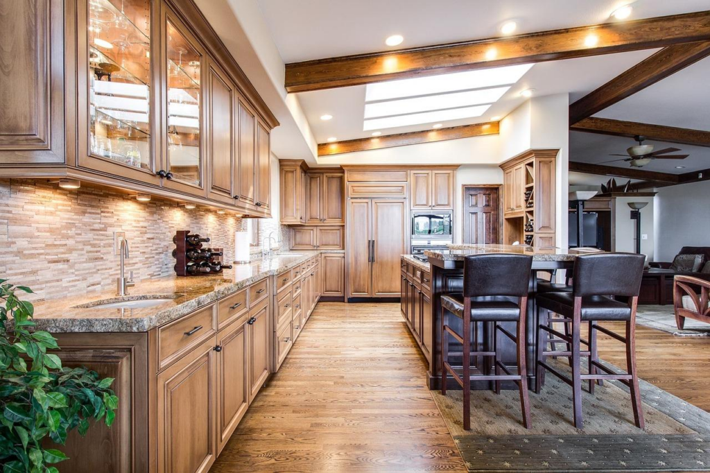
A pattern does not automatically make a room look larger or direct circulation. The result depends on the room proportions, sightlines, contrast and placement. Produce a scaled setting-out drawing for complex layouts rather than relying on a small sample image.
Tile Size, Joints and Setting-Out
Large-format tiles reduce the number of joints and can create a calm surface, but they demand suitable substrate flatness, handling, mortar coverage and coordinated cuts. Smaller modules can adapt to irregular rooms and pattern changes but introduce more grout. Select the module after mapping the island, cabinet toe kicks, door thresholds, floor drains and visible perimeter cuts.
Grout width and color are part of the design. A close color match softens the grid; a contrasting grout emphasizes it. Confirm the joint width permitted for the selected tile and installation standard. Include movement joints separately—they should not be disguised as ordinary grout joints.
Finish, Texture and Cleaning

(Source)
Matte, structured, honed and polished surfaces respond differently to spills, side lighting and cleaning. A visibly textured tile is not automatically slip-resistant; review the declared classification and the project’s wet-use criteria. Deep texture may also hold residue, while highly reflective surfaces can show streaks or make lippage more visible.
Test the proposed cleaning method on an approved sample. Confirm whether the tile or grout requires sealing, whether the selected chemicals are compatible and how grease or colored food spills will be removed without damaging the finish.
Coordinate Transitions and Adjoining Rooms
Kitchen floors often meet timber, carpet, exterior paving or another tile. Coordinate finished levels, underlay or screed thickness, thresholds, edge trims and movement at every transition. The wider guide to flooring options for different rooms can help compare adjoining materials before levels are fixed.
Cabinet installation sequence also matters. Agree whether units sit on the tiled floor or the tile stops at toe kicks, and record the decision on drawings. Use the kitchen design coordination page to align cabinets, countertops, appliances and floor finishes.
Sample Board and Tile Schedule Checklist
- Room reference, area and expected traffic or wet exposure
- Manufacturer, collection, product code, nominal and actual size
- Color, shade range, pattern variation, finish and edge condition
- Floor-use suitability and required declared performance data
- Pattern, direction, centerline, border, cut strategy and joint width
- Grout type and color, movement joints, trims and transition profiles
- Substrate, waterproofing or crack isolation, adhesive and installation requirements
- Quantity, waste allowance, shade or caliber control and replacement stock
- Approved full-size samples, mock-up reference and sign-off responsibility
Turn the Design Idea into a Buildable Schedule
The strongest kitchen floor concept combines a coordinated palette with verified product data, realistic setting-out and clear installation interfaces. Share the plans, cabinet and countertop finishes, preferred tile references, quantities and project location before final selection. To coordinate samples and quotation, send George House Material your kitchen material requirements.