The best color for kitchen cabinets depends on the kitchen you already have. A pale finish can be a useful starting point when daylight is limited, a muted midtone can soften contrast, and a dark finish can define an island or cabinet run. Each choice needs to work with the existing countertop, floor, lighting and amount of cabinetry.
Start by identifying the condition that matters most: a dim room, a warm floor that must stay, a strong contrast preference, or surfaces that are handled throughout the day. Use that condition to narrow the options, then compare actual cabinet finish samples. A color name or a photograph cannot establish how the finished door will look or perform in your kitchen.
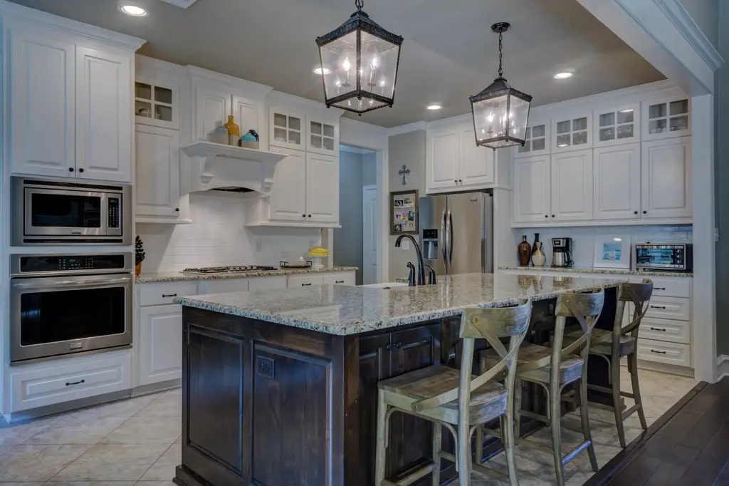
Choose a Color Direction for Your Kitchen Conditions
Use this table to choose a direction for sampling. These are starting points for comparison, not rules that prescribe one color for every kitchen.
| Main condition | Options to compare first | Check before choosing |
|---|---|---|
| Limited daylight or a large wall of cabinets | Soft white, off-white or a pale neutral | Does the sample look gray, yellow or flat in the least-lit corner? |
| Warm timber, beige stone or cream finishes that will remain | Warm off-white, greige, taupe or a restrained green | Does the cabinet undertone clash with the existing finish? |
| Cool white or gray fixed surfaces | Neutral white, balanced gray or a contrasting deeper tone | Do two near-matching whites make one surface look discolored? |
| Bright room with a strong contrast preference | Navy, charcoal or black in a defined cabinet zone | Is useful detail still visible when daylight falls? |
| Frequent handling and visible surface marks | A restrained midtone alongside a lighter and darker comparison | Which complete finish makes the expected marks noticeable, and how is it cleaned? |
| Existing wood finishes that need visual continuity | Natural timber or a painted neutral that complements it | Is the proposed grain and color variation acceptable across several doors? |
Start With Daylight and the Amount of Cabinetry
Small Kitchens and Rooms With Limited Daylight
Compare lighter cabinet finishes if the room feels visually heavy. Include the tall units and upper cabinets in the assessment; a small color chip gives little sense of a full wall of doors. A lighter appearance can change the impression of the room, but it does not increase its floor area or replace task lighting.
Do not assume that the brightest white is the best choice. A stark white can look disconnected beside a warm floor, while an off-white may look too creamy against a cool countertop. Check the candidates in the darkest part of the kitchen and under the lights used in the evening.
Bright Kitchens and Open Rooms
In a bright kitchen, a deeper color may be worth testing where a defined visual boundary is wanted. Look from the adjoining living or dining area as well as from the countertop. The amount of dark cabinetry matters as much as the color itself.
Light and sheen can alter perceived color. Sherwin-Williams guidance on light and finish explains why the same paint can appear different under changing lighting and viewing conditions. Compare the proposed door finish under the kitchen’s actual lighting rather than relying on an online image.
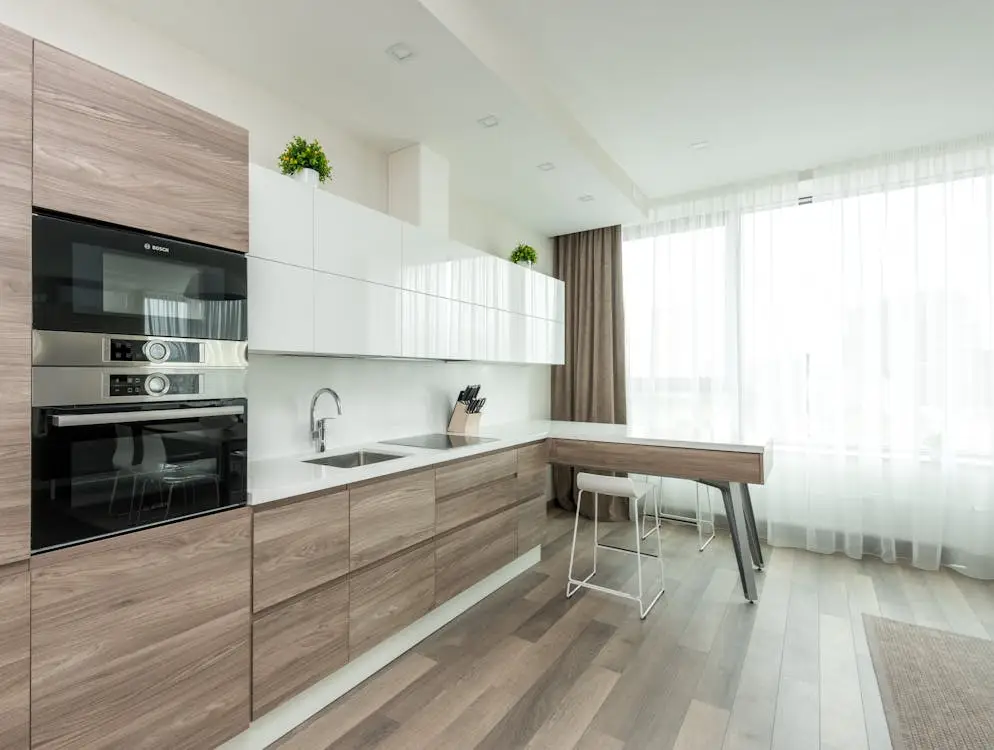
Use Existing Finishes to Eliminate Poor Matches
List the surfaces that will remain before selecting a cabinet color. The countertop, floor and backsplash usually occupy large visible areas. Wall paint and small accessories may be easier to adjust, so they should not automatically determine the cabinet finish.
Compare undertones as well as lightness. A pale cabinet and a pale countertop can still look unrelated if one reads warm and the other cool. Similarly, a gray cabinet may appear blue, green or violet beside a neighboring material. Use the actual materials to identify a conflict instead of trying to solve it from color names alone.
If a retained floor has strong grain or a countertop has busy veining, a quieter cabinet color is a useful comparison. If the fixed surfaces are restrained, a more pronounced cabinet contrast may be easier to assess. These are design judgments to test in the room, not performance claims about a color family.
Once the shortlist is established, use the cabinet color combinations guide for fixed surfaces for detailed coordination with countertops, floors, backsplashes and hardware.
Compare the Main Cabinet Color Options
White and Off White
White and off-white are useful candidates when a light cabinet background is wanted. Choose between them by comparing the countertop background, wall color and retained floor. A clean white may fit a cooler palette; a warmer off-white may sit more comfortably with beige stone or warm timber.
The risk is an unintended near match: one white can make another look gray or yellow. Inspect the whole sample door next to the neighboring surface. Also consider whether splashes and marks would be noticeable on that finish. The white kitchen cabinet guide gives further examples of this color direction.
Greige Taupe and Warm Gray
Greige, taupe and warm gray can provide an intermediate step between a very light cabinet and a strong dark contrast. They are worth comparing when white looks disconnected from the room or the owner prefers a softer change between cabinet fronts and fixed surfaces.
Check the underlying color carefully. A neutral that looks balanced in isolation may show a green, pink or violet cast beside the floor. There is no automatic stain resistance or resale advantage attached to a gray finish. See the gray kitchen cabinet guide for related finish choices.
Muted Green
A muted green is a candidate when some color is wanted without a highly saturated cabinet wall. Compare its warmth and depth with the existing timber and stone. A yellow-leaning green and a cooler gray-green can produce quite different results beside the same countertop.
If a full green cabinet run feels too dominant, test it in one architectural zone, such as an island. Consider the sage green kitchen cabinet guide after confirming that this direction works with the room.
Navy Charcoal and Black
Deeper colors can define an island, frame a wall of cabinets or provide a deliberate contrast with lighter surfaces. Review how much of the room they occupy and whether cabinet detail remains visible in the evening. A dark perimeter can behave differently from a dark island surrounded by light finishes.
Check dust, fingerprints, water marks and edge details on the proposed product rather than assuming that a dark color conceals everything. Use the navy blue cabinet guide or the black kitchen cabinet guide for more specific examples.
Natural Wood
Natural wood is an option when the grain and material character are part of the desired appearance. Compare it with the existing floor across more than one door. A stain name does not describe every variation in grain, veneer layout or tone.
If the floor already has prominent grain, test a quieter wood selection or a painted cabinet finish alongside it. For the next stage, the wood kitchen cabinet guide covers this material direction. The final appearance still depends on the selected material and finish.
Decide Where Contrast Is Useful
Choose the location of a contrasting color before choosing the exact shade. An island, a tall cabinet bank or lower units can form a clear zone. Scattering a second color across unrelated doors can make the design harder to read.
Look at the cabinet elevations and the view from adjacent rooms. A large dark unit may become the main visual feature even when it occupies little floor space. If that emphasis is unwanted, compare a lighter or less contrasting finish. Use the same check for a wood accent that differs strongly from the floor.
Keep the color choice connected to the cabinet arrangement. For broader planning, refer to the kitchen design guide. Detailed combinations remain the task of the fixed-surface coordination guide.
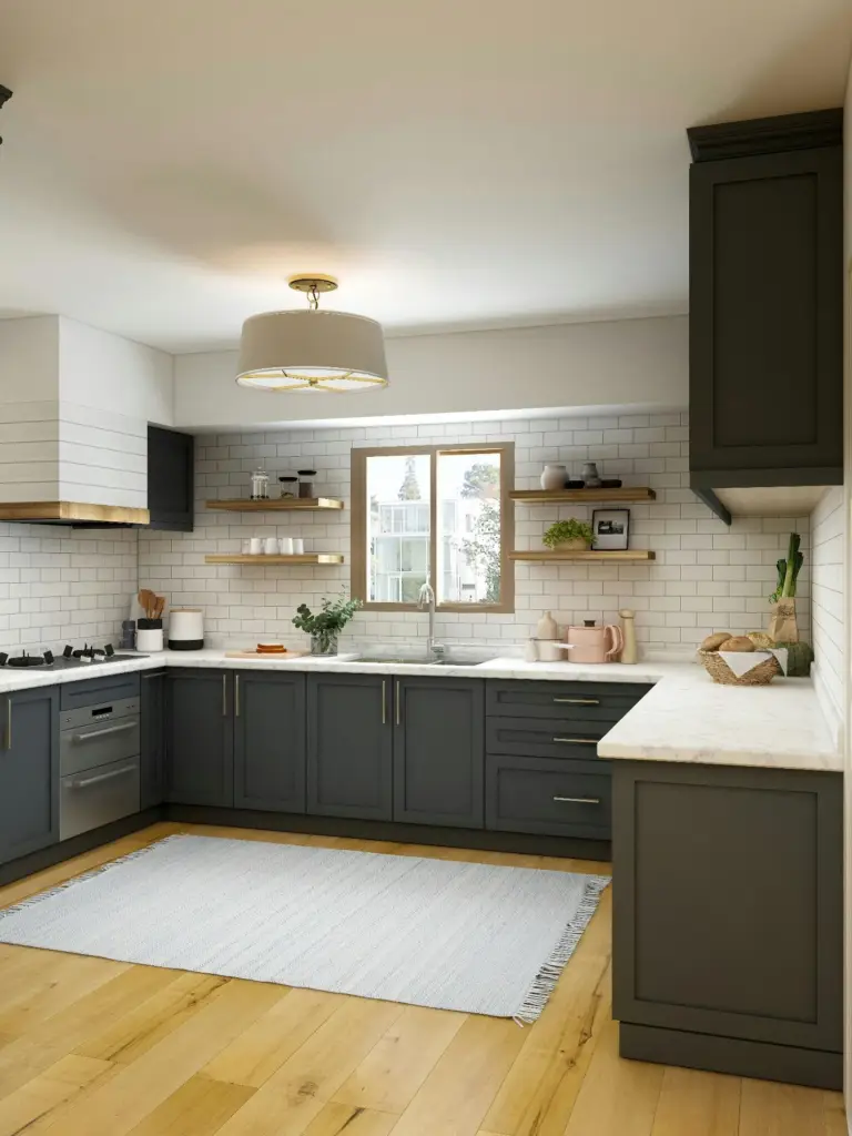
Judge Maintenance by the Finish and the Visible Marks
Color affects which marks are noticeable. Cleaning requirements and resistance to stains, moisture or wear depend on the complete cabinet finish and the manufacturer’s instructions. A surface that hides a mark is not necessarily easier to clean or more resistant to damage.
| Appearance choice | What to inspect on the sample | Information to request |
|---|---|---|
| Very light finish | Visibility of the splashes and marks expected in this kitchen | Approved cleaning method and care restrictions |
| Very dark finish | Dust, fingerprints, wipe marks and exposed edge details | Relevant finish information and repair limitations |
| Restrained midtone | Whether common marks blend into the surface or remain noticeable | The same care guidance used for other candidates |
| Wood or textured finish | Grain variation and whether surface texture complicates wiping | Care instructions for the exact material and coating |
| Different sheen options | Reflections and visible marks at several viewing angles | Samples of the specified sheen and finish system |
Test only cleaning methods approved by the manufacturer. Do not improvise abrasive cleaning or a destructive stain test on a sample that must be retained. Ask for relevant product evidence when a performance requirement matters to the project.
The KCMA A161.1 certification program evaluates cabinet construction and finish among other attributes. A color name is not evidence of certification. Where certification is specified, verify the manufacturer’s documentation for the exact product offered.
Shortlist Colors With a Clear Reason
Keep a small shortlist that represents meaningful alternatives. Two or three candidates can be a useful planning example: a lighter option, an intermediate tone and a more contrasting choice. There is no required number of colors to sample.
- Write down the main constraint, such as limited daylight or a retained warm floor.
- Exclude candidates that conflict with the fixed surfaces.
- Compare the remaining finishes in their intended cabinet locations.
- Check the evening view and the lighting used for normal kitchen tasks.
- Review visible marks and the manufacturer’s care requirements.
- Record why the preferred option works and why the alternatives were rejected.
Benjamin Moore’s sampling guidance distinguishes color samples from final paint performance and recommends reviewing color under changing light. Use a representative finished cabinet sample for the final product decision. A paint chip, rendering or digital swatch can help narrow the direction, but does not establish the appearance of a particular factory-applied cabinet finish.
For the wider sample-selection and finish-approval process, use the evergreen cabinet color and finish guide. If an annual palette is relevant to the brief, consult the 2026 cabinet color selection guide separately.
Work Through Three Kitchen Scenarios
A Dim Kitchen With a Warm Floor
Begin by comparing a warm off-white with a pale greige that fits the retained floor. Look at the samples near the least-lit tall cabinet as well as beside the window. If the off-white looks too yellow or the greige looks muddy under the evening lights, reject that particular sample. The color family alone cannot resolve the mismatch.
A Bright Kitchen With a Contrast Preference
Compare a navy or charcoal island against a lighter perimeter option. View the arrangement from the adjoining room and after daylight has faded. If the contrast dominates the space or hides details that should remain visible, reduce the area of the dark finish or compare a lighter tone. Do not assume that every cabinet needs the same color.
A Kitchen With Frequent Handling
Compare the same type of door in a light finish, a restrained midtone and a deeper finish. Inspect normal handling marks under the kitchen lights and review the care instructions. Choose according to the acceptable appearance and maintenance routine. A finish described as matte or a color described as dark does not automatically satisfy that brief.
Kitchen Cabinet Color Questions
What Is the Best Cabinet Color for a Small Kitchen
A light neutral is a useful starting point when a lighter cabinet background is wanted. Compare it with the floor and countertop, and check it under the installed lights. A small kitchen can also use a deeper accent if the amount and location are deliberate. Color does not change the room’s usable dimensions.
Are White or Gray Cabinets Better
Choose between the actual samples. White may provide the lighter background you want; gray may create a softer transition with surrounding materials. Reject either sample if its undertone conflicts with the retained finishes. Neither color is automatically more durable or more valuable at resale.
Which Cabinet Color Hides Dirt Best
The answer depends on the type of mark, lighting and surface finish. Compare the expected marks on representative samples, then check how the approved cleaning method works. Concealment is an appearance judgment and should not be treated as stain resistance.
Should the Island Match the Other Cabinets
It can match when a continuous appearance is preferred, or contrast when the island should form a distinct zone. Check the island’s visual size and its relationship to the floor and adjacent room. A second color should have a clear location and purpose.
Which Cabinet Color Is Best for Resale
There is no verified universal resale return attached to one cabinet color. If resale is part of the brief, consider the local market and avoid treating a broad trend claim as evidence. The immediate design decision still needs to suit the kitchen’s fixed surfaces, lighting and finish quality.
Prepare a Cabinet Color Brief
A useful brief records the selected direction and the conditions behind it: daylight, fixed surfaces that remain, cabinet zones, desired contrast, expected handling and the finish sample reviewed. Include the reason for rejecting competing options. This gives the next design or procurement review a clear basis for checking the selection.
For a project review with George House Material, send the cabinet drawings and color requirements together with photographs of the existing kitchen, relevant material samples and any specified finish-performance criteria. Keep the color decision tied to the proposed cabinet product and the project information.